
Technology
Google’s Iconic ‘G’ Gets a Subtle Yet Powerful Makeover, Signalling a New AI-Driven Era
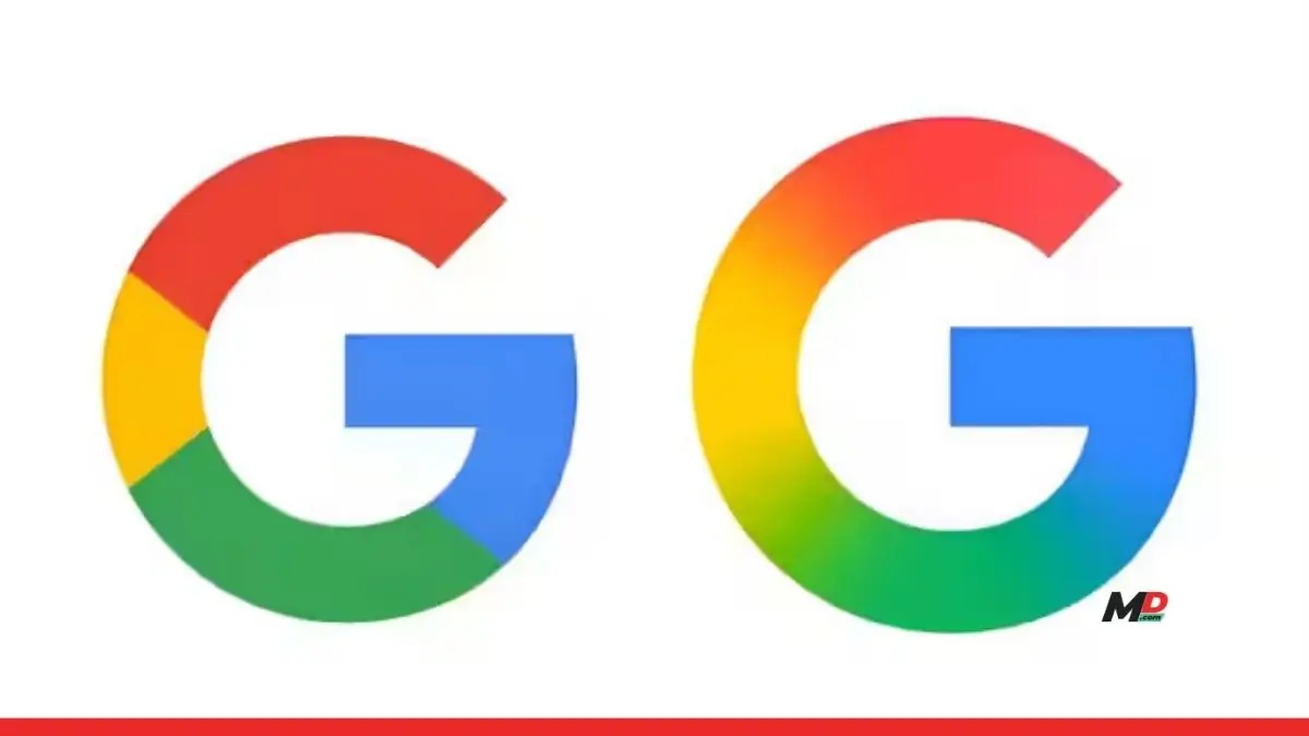
After nearly a decade of visual consistency, Google has unveiled a subtle yet significant redesign of its iconic ‘G’ logo. Known to billions across the globe, this single-letter emblem has been refreshed with a modern gradient that signals more than just a stylistic update—it is a quiet declaration of Google’s evolving identity in an increasingly AI-focused world.
A Modern Shift: From Solid Colours to Fluid Gradient
The updated logo retains the familiar shape and structure that users recognize instantly, anchored in the Product Sans typeface introduced in 2015. However, the once-solid blocks of red, yellow, green, and blue are now seamlessly blended into each other through a gradient effect. This subtle design evolution brings more depth, visual harmony, and sophistication to the emblem. The once-crisp boundaries between colours have been softened, making the logo feel more organic and fluid.
This change aligns the logo with current digital design sensibilities, where gradient shading adds dimension and polish. It also improves visual clarity across a wide range of devices and screen resolutions, a necessity for a brand as omnipresent as Google. The new look is already live on the Google Search app for iOS, and users on Android have begun to see it via the 16.18 beta release, particularly on Pixel devices.
Brand Identity in the Age of AI
While Google has not provided an official explanation for the logo’s redesign, the timing and design choices strongly suggest alignment with its larger AI strategy. In recent years, Google has steadily integrated its generative AI technology, Gemini, into services such as Gmail, Docs, Calendar, and Drive. Gemini itself features a blue-to-purple gradient, a visual motif echoed in this new ‘G’ logo.
The redesign is thus more than a visual refresh—it’s a symbolic gesture, a nod to the company’s deepening relationship with AI. It signals a strategic direction where Google’s identity is increasingly defined not just by search or cloud services but by intelligent, AI-enhanced ecosystems that work seamlessly across platforms.
Rollout Status and What’s Next
Currently, the updated logo has rolled out on the iOS version of the Google Search app and is slowly appearing for Android users via the beta channel. However, the update has yet to reach the general Android user base or appear prominently on the web version. There’s no official word yet on whether the change will extend to other widely used Google products such as Chrome, Maps, or Gmail.
As with Google’s 2015 redesign, where the company replaced the old serif logo with a clean, sans-serif typeface to reflect its mobile-first approach, this latest shift could be the beginning of a broader visual overhaul. It’s reasonable to anticipate that similar gradient-infused updates could follow for other Google app logos, especially as the company unifies its branding under an AI-centric vision.
The Bigger Picture: A Strategic and Visual Pivot
Though visually understated, the redesigned ‘G’ is emblematic of something larger—a transition point in Google’s evolution. It is the kind of change that seems minor at first glance but carries long-term implications for brand positioning. Just as the 2015 update reflected Google’s pivot to mobile and multi-platform services, this 2025 refresh is rooted in the company’s commitment to artificial intelligence as the cornerstone of its future.
By infusing its visual identity with modern gradients, Google isn’t just updating a logo. It’s setting the tone for the next chapter, where AI is seamlessly woven into the very fabric of the user experience. In this way, the new ‘G’ serves not only as an icon but as a symbol of transformation, innovation, and the digital intelligence that lies ahead.