
Business
Mirinda unveils new visual identity targeting Gen-Z consumers
Mirinda, the popular carbonated soft drink brand, distributed globally by PepsiCo, has undergone a major brand revamp and unveiled a new global platform, “There’s no flavour like your flavour”, which honours creativity and uniqueness in all generations. Following Pepsi’s rebranding initiative, Mirinda’s latest visual identity prioritizes boldness, with the intention of engaging with Gen Z customers.
The global soft drink brand intends to establish a more profound connection with its Gen Z audience and position itself as a brand that aligns with their spirits and beliefs. The brand acknowledges the necessity of staying pertinent in a swiftly changing market and believes that engaging with the younger generation is crucial for its enduring prosperity.
The latest global brand tagline and direction establishes the brand as an embodiment of the upcoming generation. It honors and acknowledges these enthusiastic creators who express their ingenuity and authenticity both in their virtual and real lives. Alongside the unveiling of the #NoFlavourLikeYourFlavour campaign, Mirinda has received a bold new visual identity dubbed “Making an M-pact,” designed by PepsiCo Design and Innovation to ignite creativity.
The iconic M: A Mix of boldness and vibrancy
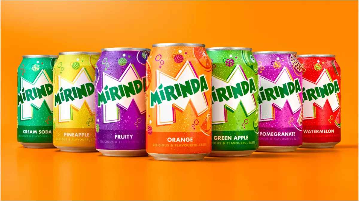
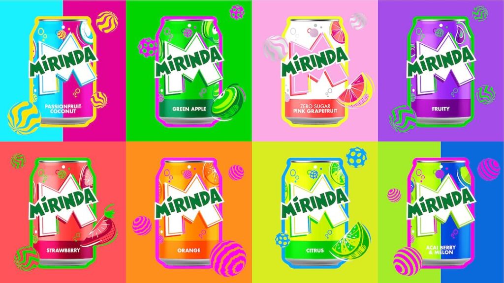
The iconic Mirinda “M” serves as a canvas of creativity from which the brand is brought to life. Mirinda’s revitalized logo showcases a modern and dynamic typography, boasting a brighter green color with sharper corners and cleaner lines, to accentuate its unique identity. This design conveys the brand’s youthful and playful character.
Furthermore, the new visual identity features a lively color scheme that includes a blend of striking and vivid hues, intensifying Mirinda’s lively personality and providing a burst of refreshment, while twirling spheres, fizzing bubbles and zesty fruit illustrations convey a sense of playfulness and energy throughout.
Each of the brand’s 50+ fruit flavours, including Green Apple, Orange, Pineapple, Strawberry, and Watermelon, will be given a corresponding colour palette, each with their own vivid, contrasting colourways.
Moreover, this isn’t the first time the brand has gone through a transformation to keep up with changing times. Making a major change to the logo back in the 70s, the brand made many tweaks through the decades.
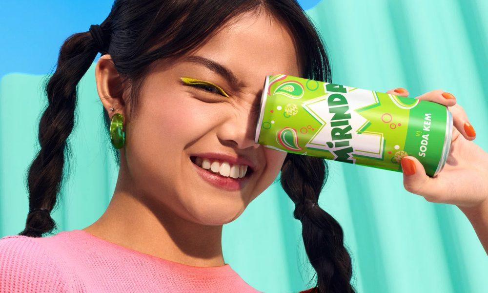
Mirinda’s flavour offerings are tailored to the unique palate of communities around the world, including Green Cream Soda and Orange Tamarind in Vietnam, and Acai Berry in Poland. The new visual identity will be visible on all Mirinda cans, merchandise, advertisements, retail displays, and digital media across its 200 markets.
Commenting on the rebrand, Eric Melis, vice president global brand marketing at PepsiCo, said this marks the first step for the brand as it continues to evolve and grow in line with the youth of today.
“We are pleased to unveil Mirinda’s new global brand platform that inspires vibrant creativity, encouraging Gen Z to harness their uniqueness as a superpower. Through #NoFlavourLikeYourFlavour we have developed a refreshing new visual identity and platform, which Mirinda fans can identify with – one that empowers this generation to resist conformity and instead, embrace self-expression. This marks the first step for the brand as we continue to evolve and grow in line with the youth of today. We look forward to rolling out the exciting plans we have in the pipeline.” he added.
Meanwhile, Mauro Porcini, SVP and chief design officer of PepsiCo, said, “Mirinda’s 50+ flavours are a treat for the senses, and we wanted the brand’s visual identity to look and feel the same. PepsiCo Design and Innovation brought Mirinda to life with vibrant, contrasting colours and bespoke illustrations that create a sense of dynamic energy and playfulness. We know Mirinda fans engage with the brand digitally as much as they do physically, so we created a visual identity that retains its excitement and distinction across all platforms.”
Mirinda’s new visual identity will be rolled out across the leading 20 international markets from May, with many featuring their native languages on the cans. Kicking off with Vietnam and Thailand, the new visual identity will then appear in Poland, Romania, Czechia, Ukraine, Hungary, Croatia, Gaza/Palestine, Mexico, Argentina, Egypt, Iraq, Uganda, Ethiopia, China, Pakistan, Kuwait, Qatar, Oman, Bahrain, and the United Arab Emirates, with many more to come.
Zero Sugar Orange flavor
Mirinda has encouraged healthier choices among its customers by introducing low-sugar alternatives, in addition to its new brand platform and visual identity system. As part of this commitment, and to align with PepsiCo’s pep+ program to hasten the reduction of added sugar in its overall portfolio, the brand has successfully introduced its Zero Sugar Orange flavor in Poland and Nigeria, and plans to extend its low and no sugar product range globally.
The rebranding of Mirinda is a strategic move to remain relevant and appeal to the ever-evolving market. With its new look and focus, Mirinda is poised to connect with its younger audience on a deeper level and achieve long-term success in the carbonated soft drink industry.