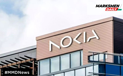
Nokia changed its brand identity for the first time in nearly 60 years with a new and refreshed logo to mark the beginning of a new era.
The updated logo comprises five various shapes forming the word NOKIA. The old iconic blue color logo has been changed for a range of colors depending on the use. During an interview, Pekka Lundmark, Chief Executive, said, “There was the association to smartphones, and nowadays, we are a business technology company.”
Once known for smartphones, the company is now a business technology company and wants to align itself accordingly. While Nokia still aims to grow its service provider business by selling equipment to telecom companies, its primary emphasis has shifted to supplying gear to other enterprises.