

Business
Instagram has a new wordmark. Say hello to ‘Instagzam’


There are certain words so deeply embedded in popular culture that you barely need to read them. Coca-Cola. Google. Disney. Nike. Instagram.
For more than a decade, Instagram’s familiar cursive wordmark has been one of those instantly recognisable pieces of corporate typography. You could see it from across a room and know exactly what it was.
Now Instagram has changed it. And, somehow, the internet is looking at the new version and asking the same question: Is that supposed to say Instagzam?
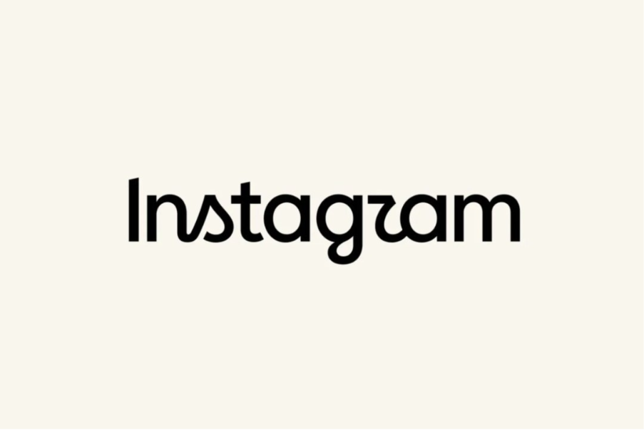
Instagram has unveiled its first wordmark redesign in roughly 10 years, replacing its familiar flowing script with something that sits awkwardly between cursive and print. The camera icon remains unchanged, so this is not a wholesale rebrand. It is, ostensibly, a refinement of the brand’s written identity.
Instagram chief Adam Mosseri described it as “cleaner and more modern”, while retaining references to the original design and the simplicity and craft associated with Instagram. The problem is that the human eye has apparently declined to sign off on the brief.
The old wordmark had one considerable advantage: it looked like handwriting. You knew what it was doing. The letters flowed into one another, and although it was stylised, the word had a coherent visual rhythm.
The new version seems to have taken a different approach. Some letters behave as though they have been told to write in cursive. Others appear to have received the memo about a modern sans-serif typeface. The result is a peculiar hybrid in which certain strokes connect, others abruptly stop, and the “r” has become the principal suspect in what may be the world’s most unnecessary identity crisis.
Look at it quickly and, yes, “Instagram” can become “Instagzam” with alarming ease.
That reaction is not confined to a handful of people having a bad typography day. Design and Instagram communities have been making the same joke repeatedly since the new wordmark appeared, with users variously reading it as “Instagzam”, “Instagazm” and other inventive mutations.
Change for change’s sake helps no one
There is a larger design lesson hiding inside the joke. A wordmark does not merely have to look contemporary. It has to communicate. In fact, the more famous the brand, the less work the viewer should have to do. Instagram already possesses extraordinary brand recognition. The job of its wordmark is therefore not to prove that its designers are capable of inventing unusual letterforms. It is to reinforce recognition while giving the identity enough flexibility to remain relevant.
Instagram appears to have decided that its old wordmark needed modernising. Fair enough. But the strangest part of the redesign is that the company seems to have preserved the visual complexity of handwriting while removing some of the clarity that made the original so effective.
Even Instagram appeared to anticipate the controversy. Mosseri posted the redesign on Threads asking people to share their “hot takes”, while Instagram’s design team subsequently showed several alternative typefaces that had been considered. Some of those options arguably looked considerably easier to read.
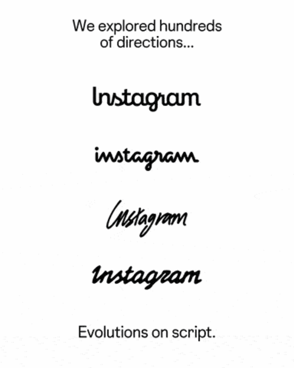
Which leaves us with a slightly unfortunate branding paradox. Instagram wanted a wordmark that looked newer, and it has certainly succeeded at that. But it also got one that, at first glance, appears to belong to a social network called Instagzam.
And perhaps that is the most Instagram thing about it. The company has spent years teaching the internet to obsess over images, only to give everyone something new to stare at and complain about.